Country-Specific Advertising Creative Insights for Global Expansion
This content is
<Global Ad Creative Insights>
analysis report
📝Here’s a 3-line summary!
- In Japan, there was aclear tendency to maximize the proportion of text relative to imagesand to use emotional language.
- K-Beauty brands entering the Japanese market are employing a variety of strategies, ranging from maintaining their own identity to fully embracing local trends.
- In the U.S. ,creatives centered on confident, concise copy and practical benefitswere predominant.
Global advertising: What works varies by country
“How should I create global ad creatives??
'Wouldn’t it be enough to just use generative AI for translation?'
I’m sure everyone has wondered this at least once,
but the truth is, there are country-specific “trends” even in “ad creatives.”
Today, focusing on Japan and the U.S., we’ve compiledcountry-specific creative insightsyou need to know when producing global ads.
If you’ve ever wondered what kind of content works on funding platforms in other countries,
and what global customers expect,
this article will thoroughly answer all your questions!
🇯🇵 Japan – Creative approaches that “maximize text” and use “emotional language”
💡 1. Copywriting strategies based on “emotional vocabulary” that tugs at the heartstrings
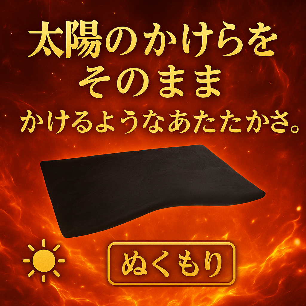
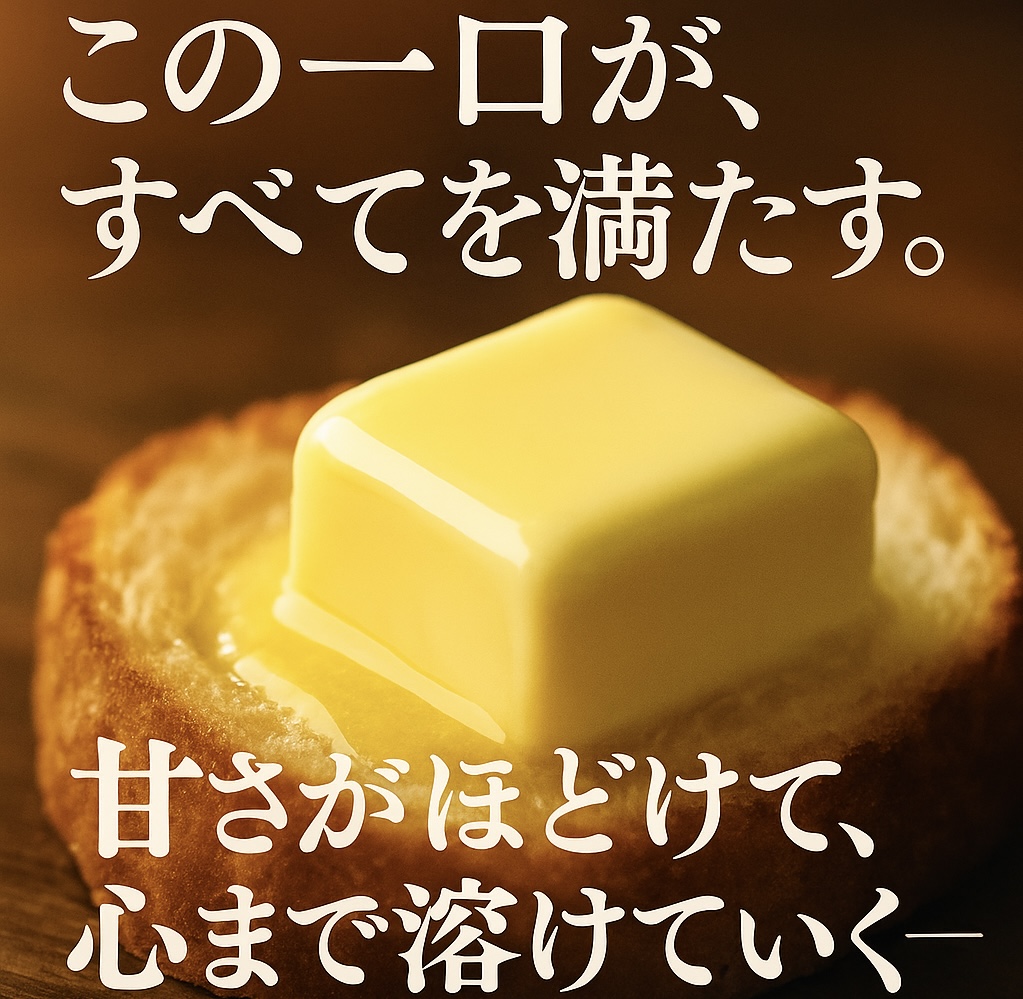
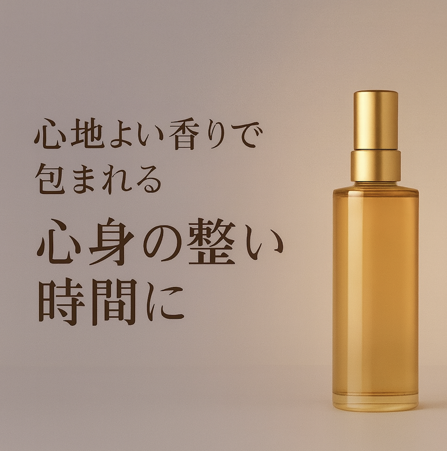
Upon analyzing major Japanese funding campaigns on platforms like Makuake and Campfire, we found that narratives centered on metaphors and emotionfar outnumbered straightforward functional descriptions.
| Home & Living | Bedding |
Food | Butter | Beauty | Hair Oil |
|---|---|---|
![]() |
![]() |
![]() |
|
"A warmth that feels like being enveloped by a piece of the sun"
|
“This one bite satisfies everything.” / “As the soft sweetness melts away, it melts your heart too.” | “A moment of calm, enveloped in a soothing scent, that brings peace to both body and mind” |
All example images were generated using generative AI to illustrate these insights.
Blanket: It used figurative language to emphasize warmth.
Butter: Rather than focusing on the product’s features or a direct description of its taste, this ad uses figurative language to highlight the “satisfaction” derived from the taste experience.
Beauty: By highlighting emotional stability and other benefits, the ad explained the ultimate lifestyle enabled by the product.
A distinctive feature was the approach of driving purchase desire based onthe emotions, moods, and experiences associated with using the product, rather than focusing on the product’s direct USPs.
This trend was distinctly different from the function-centric approach often seen in Korean campaigns, such as “It’s X degrees warmer” or “It has this feature.”
It was impressive how metaphorical expressions were strategically placed throughout the content, rather than simply listing features in a straightforward manner.
💡 2. Ad creatives with an overwhelmingly high proportion of copy relative to visuals
One of the most distinctive features of Japanese advertisingis that the text is large and abundant compared to the images.
As a result, the text really stood out visually in the ad materials.
| Food | Dessert |
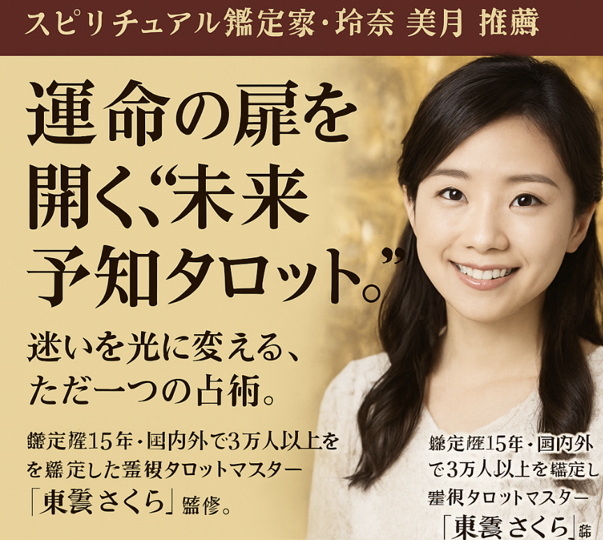
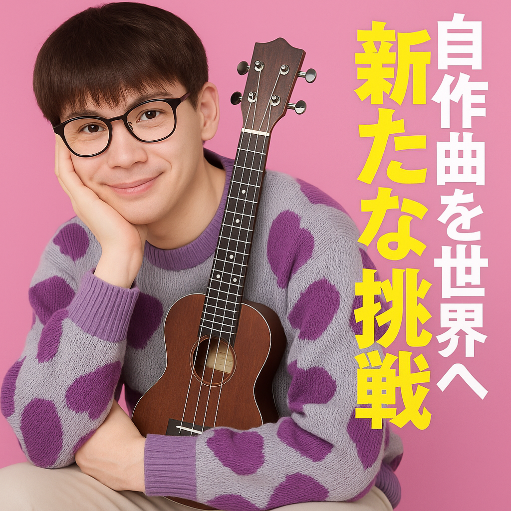
Stationery | Tarot Cards | Music | Artist/Album |
|---|---|---|
![]() |
![]() |
![]() |
|
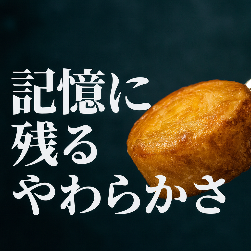
“A melt-in-your-mouth bite, an unforgettable sweetness”
|
"The one and only form of divination that turns hesitation into light" | 'Bringing my original songs to the world—a new challenge' |
Text Maximization: The text size was made significantly larger relative to the ad image to maximize visual impact.
Information Density: We concentrated as much information as possible—including product descriptions, ranking positions, and cumulative sales figures—on a single screen.
Layout Utilization: Due to the nature of the Japanese language, vertical text layouts are often used, with the product centered and text placed on either side.
As seen above, by utilizing as much space as possible within the ad to include the maximum amount of information, to maximize both “visual impact” and “information density.”.
Additionally, by using a vertical text layout, they placed the product in the center and utilized the space on both sides for text, making very efficient use of the available space.
Are there relatively restrained formats as well?An interestingpoint is that not all ads in Japan are text-heavy. Looking at ads from “Green Funding,” another Japanese crowdfunding platform, we found many ads with concise formats similar to those in Korea—unlike the platforms examined earlier. Compared to other funding platforms in Japan, there was a mix of concise materials and ads with an excess of information.Thisshows that just because it’s Japan doesn’t mean they automatically produce only text-heavy ads.
💡 3. In-Depth Analysis of the Japanese Beauty Category: The Sophisticated Design of a “Sensual Mood”
Let’s take a closer look at the “Beauty” category, which ranks among the top in terms of transaction volume on wadiz.
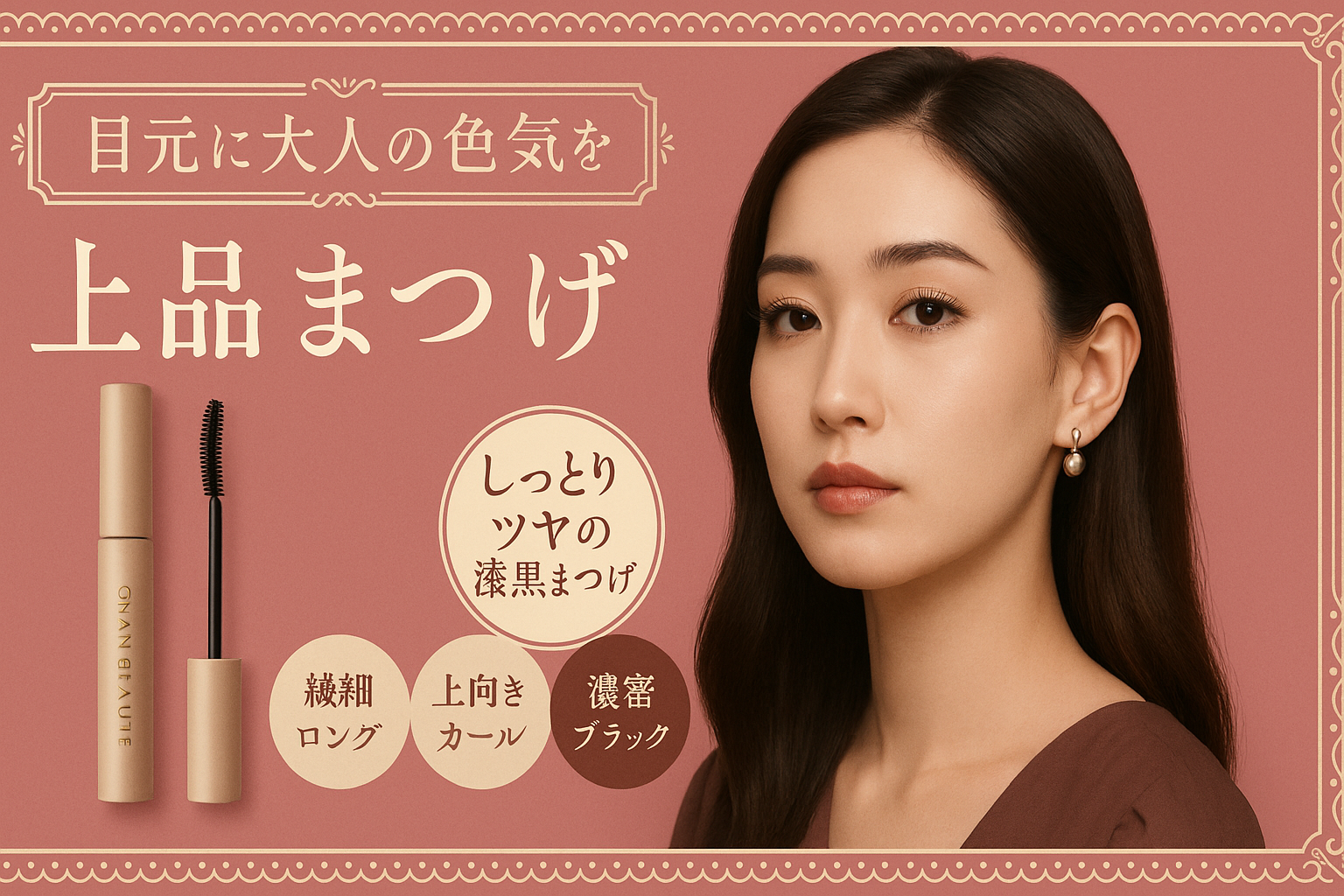
After examining the ad creatives of the top 20 popular brands on major Japanese cosmetics websites, we found that they focused on conveying a “sensual mood” .
A distinctive trend was the tendency to maximizeand portray in the ad creatives the ideal imageconsumers aspire to achieve after using the product.
*Since the number of beauty projects on Japanese crowdfunding sites is limited, we expanded our analysis to cover the entire Japanese beauty market.
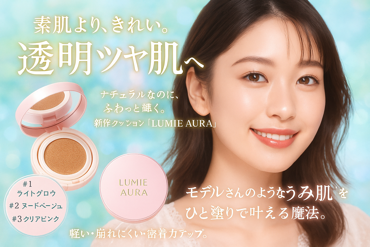
| Makeup Cushion |
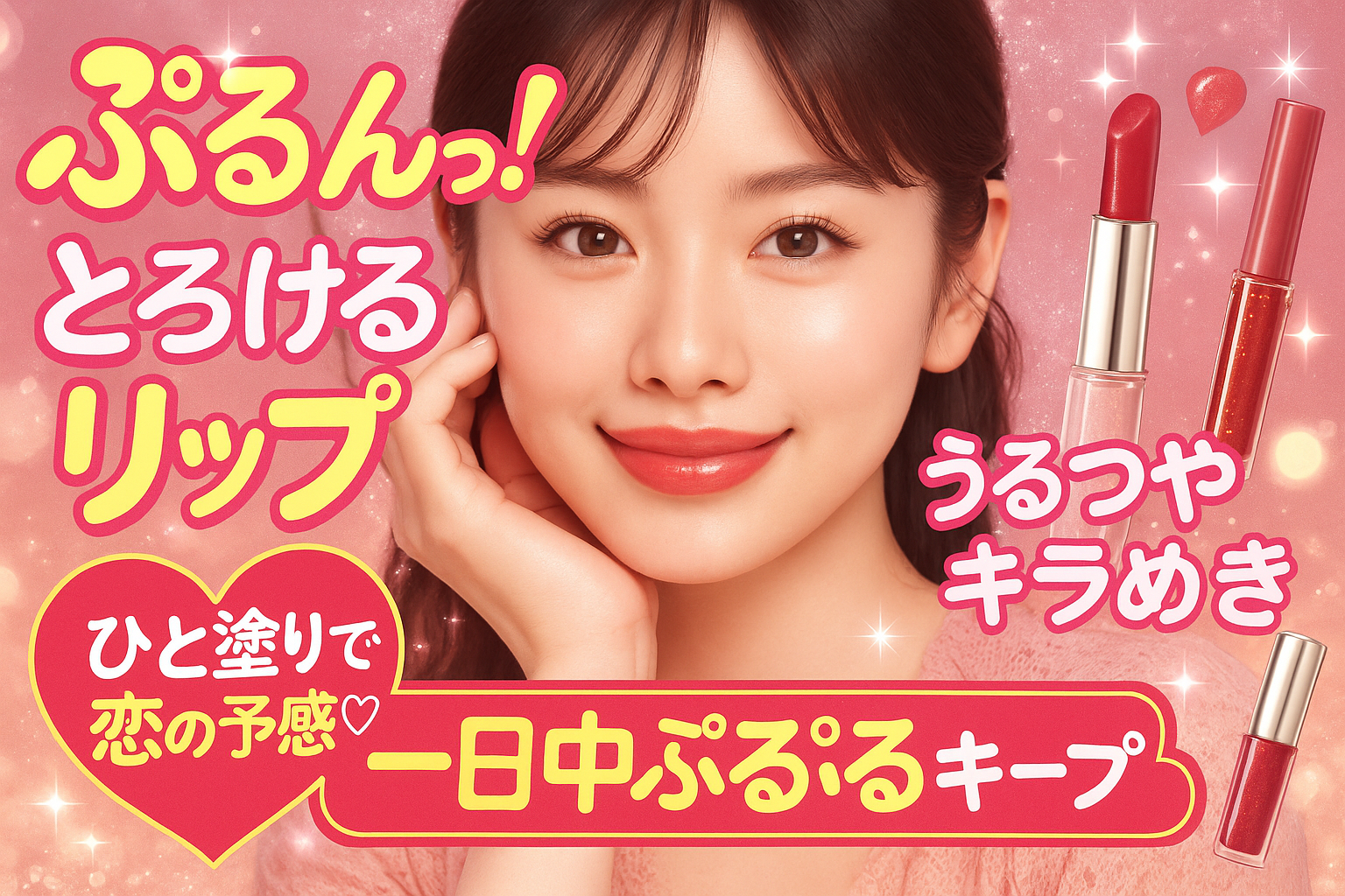
Lip Balm | Mascara |
|---|---|---|
![]() |
![]() |
![]() |
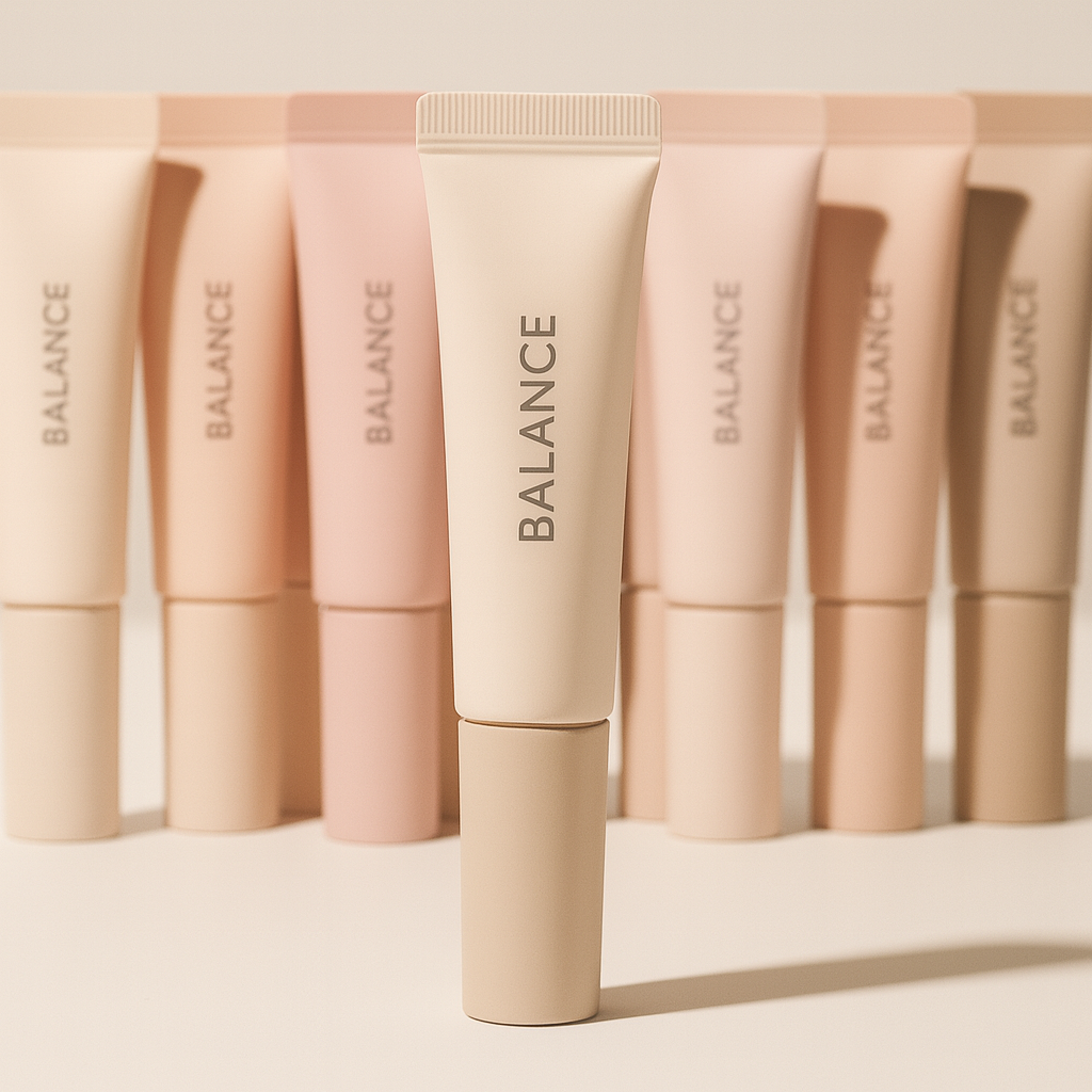
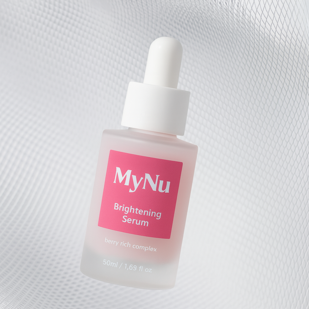
Emphasizing the Ideal Post-Use Mood: Rather than focusing on close-up details of the product, the ad presented a “complete full-makeup look” to maximize the model’s atmosphere and image as achieved through the product.
Conveying the User Experience: We actively used onomatopoeia and mimetic words to convey the sensations consumers would feel when touching or using the product themselves.
Strategic Use of Typography: We utilize fonts and layouts as key visual elements to complete the “advertising mood.”
It was interesting to see that, rather than focusing on the product itself, the ads centered on the image of the woman after using the product, maximizing the ideal image consumers aspire to achieve.
In contrast, Korean beauty advertisements often feature product-centric compositions and significantly enlarge usage shots to clearly highlight functional benefits, making the distinct contrast in approach between the two markets particularly striking.
Since the image being conveyed is so crucial in Japanese beauty advertisements, background colors are designed to be vibrant to match the desired mood, and onomatopoeia and mimetic words are actively used to create a sensory atmosphere.
I was also impressed by how they strategically combine various typographic elements to serve as visual components that complete the advertisement’s mood.
Compared to Korea, which primarily uses clean, product-focused fonts, can’t you see at a glance just how starkly different the styles of these two markets are?
💡 K-Beauty Brands Implementing Strategic Localization Through Diverse Tactics
The popularity of Korean beauty brands continues to rise, particularly among Japan’s younger generation.
As a result, not only major domestic brands but also small and medium-sized brands are racing to accelerate their entry into the Japanese market.
So, what kinds of advertising materials are these brands using to connect with consumers in Japan?
I’ll now share insights gained from analyzing ads by K-Beauty brands that have ranked among the top popular brands for teens and twenty-somethings on major Japanese beauty websites.
| Brand R |
Brand A (Initial) | Brand A (Last 6 Months) |
|---|---|---|
![]() |
![]() |
![]() |
Brand R Case Study: Most of the ad creatives featured minimal text and maintained a minimalist visual style.
Brand A Case Study: Unlike the past, when ads primarily featured close-ups of products without text, a noticeable shift toward information-rich content and diverse typography has emerged.
In the caseofKoreanbeauty brand R, it maximized the sophisticated identity unique to K-Beauty through restrained text and minimalist design, choosing not to follow Japanese advertising conventions.
However,beauty brand Ahas recently moved away fromitsprevious minimalist style over the past six months, actively embracing Japanese advertising formats.
Notable characteristics includedinformation overload, relatively large text sizes, andthe use of diverse typography.
It was striking how similar their style had become to the local style—so much so that at first glance, one might mistake it for a Japanese advertisement.
🇺🇸 United States – Persuade Clearly with “Confidence” and “Practical Benefits”
Earlier, we examined the unique formal and content-related characteristics of Japanese advertising, focusing on the crowdfunding and beauty industries.
So, what kind of advertising conventions does the U.S., the world’s largest market, follow?
This time, we analyzed advertising materials by type, focusing on “Kickstarter” and “Indiegogo,” the major U.S. funding platforms.
💡 Type 1: Advertising Text Strategies Based on Confidence & Humor
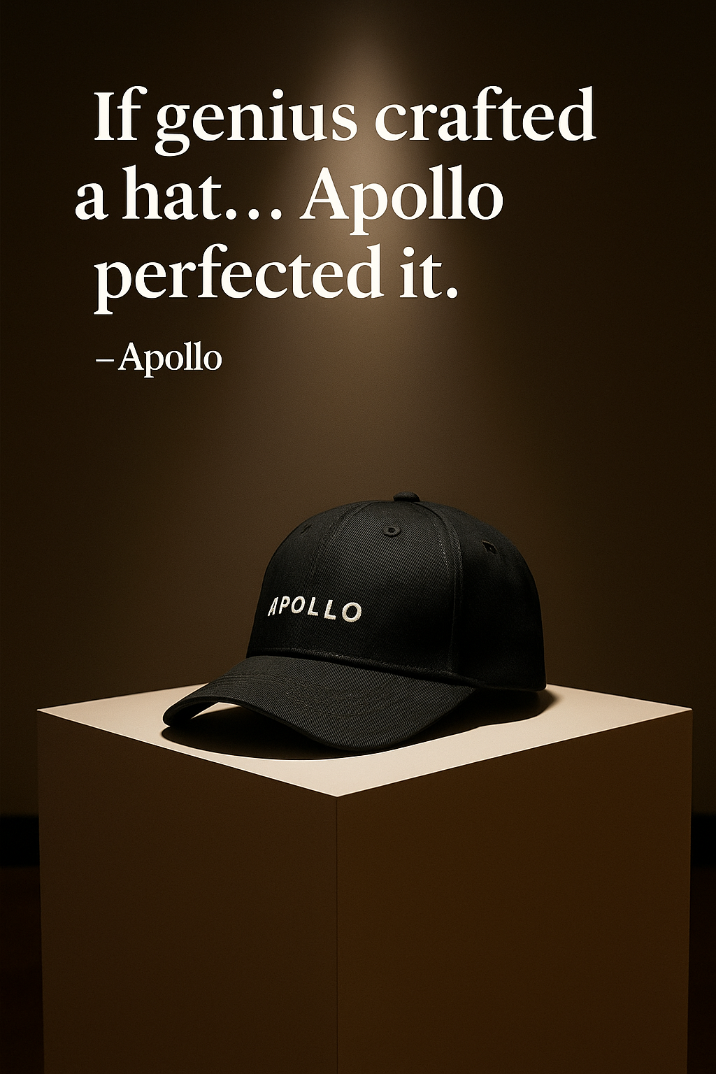
Looking at Kickstarter’s ad copy, while the text isn’t extensive, what stood out was how they captured attention by infusingshort sentences with confidence and light-hearted humor.
| Tech | Chargers |
Home | Bedding | Clothing | Hats |
|---|---|---|
![]() |
![]() |
![]() |
|
'The one and only charger you’ll ever need'
|
"Don't you get tired of sleeping in the heat?" / "Sleep much cooler with all-season bedding" | "If a genius were to design a hat, Apollo would have done it perfectly." |
Confidence & Humor: Rather than focusing on functional explanations, brands are expressing confidence in their products through assertive copy or building rapport to persuade customers.
Rather than providing lengthy explanations of features, they typically use a single, impactful sentence to express confidence in the product or build rapport, thereby persuading consumers.
Although the text is relatively short and small, it was impressive to see that they employ a strategy of conveying the brand’s personality and appeal before its unique selling points (USPs) through direct humor and a bold tone and manner.
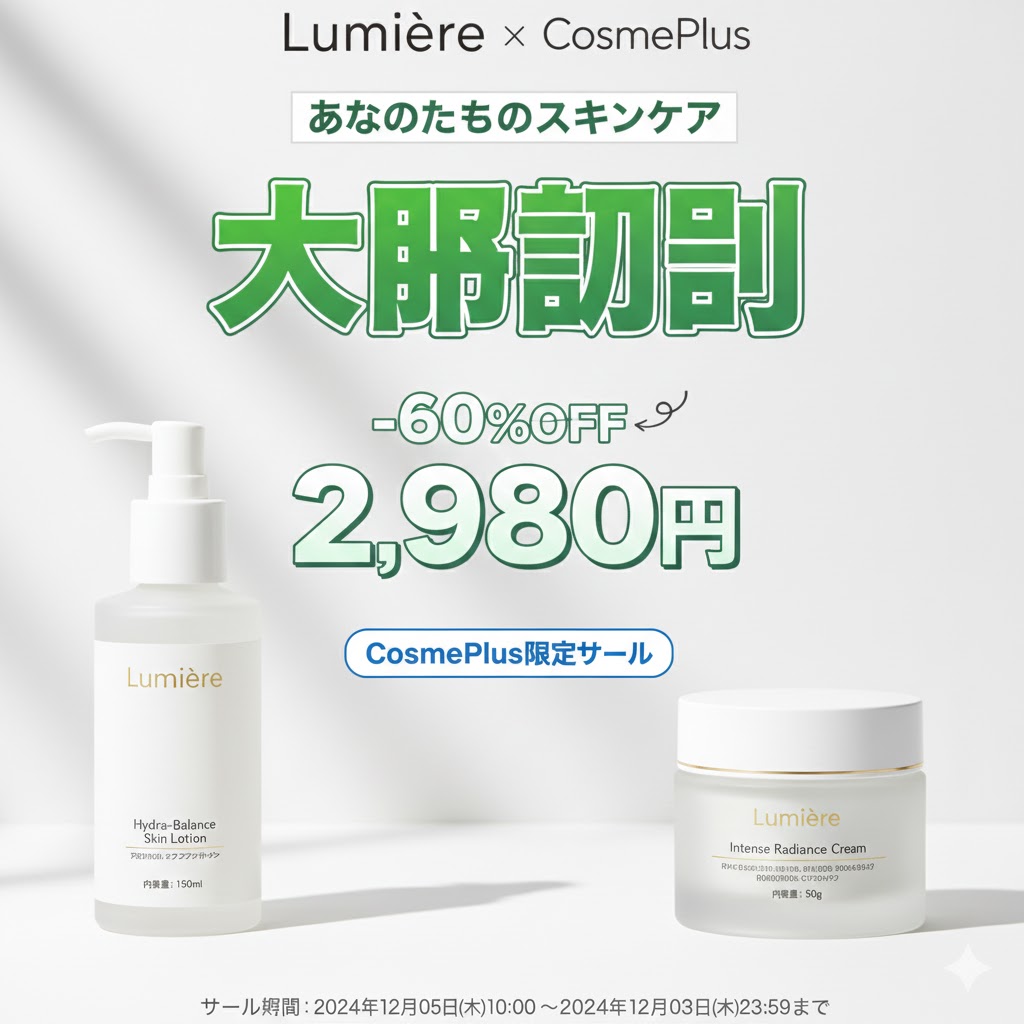
💡 Type 2: Image Content Emphasizing Price Benefits
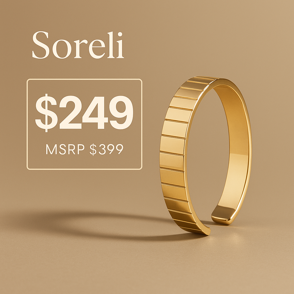
Following the first insight, the second notable feature is the stronger emphasis on price benefits.
| Tech | Gaming Consoles |
Living | Massagers | Jewelry | Bracelets |
|---|---|---|
![]() |
![]() |
![]() |
Emphasis on Practicality: Ultimately, they clearly present the “price advantage”—the most important factor for consumers—to provide a practical basis for purchasing decisions.
By intuitively communicating the benefits consumers receive—such as product price, discounted price, and discount rates—they increased the content’s engagement and highlighted its practicality.
This approach is particularly effective at minimizing the cognitive load on consumers and driving immediate purchasing behavior.
In other words, we confirmed that “presenting clear benefits” serves as a key persuasive factor in the U.S. market.
🎯 Global Creative Design Guide
To enter global markets, it is important to go beyond simple translation and strategically design creative assets by understanding the advertising conventions of each country.
As we’ve seen in today’s report, the preferred tone, amount of text, and methods of conveying information vary significantly from country to country.
WhileJapan prioritizes emotional narratives and information density, the U.S. stands out forits use of persuasive elements such as a confident and humorous tone, as well as practicality.
Now, throughwadiz’s global service, all brands can connect with customers worldwide, transcending national borders.
We hope this report will be of some help as you take that first step—one that can be both exciting and unfamiliar.
We sincerely cheer on the journey of all makers venturing into new markets! 🚀✨